
Hello,
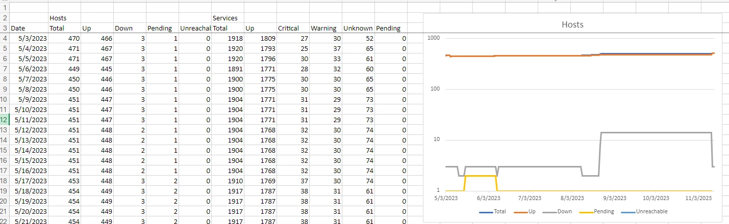
I suggest creating a new dashboard or enhancing the existing one (Availability)within Centreon to provide a comprehensive view of the total number of services and hosts, along with their status. This dashboard should prominently display information such as number of OK, Critical, Warning, Unknown, and Pending services/host statuses in real time.
Key Features of the Dashboard:
- Live Status Updates: Display the total number of services and hosts and status in real time, allowing us to quickly identify any issues or anomalies.
- Different Time Frames: Provide options to view status trends over different time frames (e.g., daily, weekly, monthly) for historical analysis and trend identification.
- User-Friendly Interface: Design the dashboard with a focus on user experience, ensuring that information is presented clearly and intuitively.
- Impactful Visualizations: Utilize visual elements such as charts, graphs, and color-coded indicators to make the dashboard visually engaging and easy to interpret.
Benefits:
- Improved Monitoring Efficiency: The dashboard will enable us to monitor a large volume of data more efficiently, reducing manual effort and streamlining decision-making.
- Real-Time Insights: With live status updates, we can promptly address issues and maintain optimal performance across our infrastructure.
- Historical Analysis: The ability to view status trends over time will facilitate trend analysis, proactive maintenance, and performance optimization.
I believe that implementing this enhanced monitoring dashboard will significantly enhance our monitoring capabilities and contribute to a more proactive and efficient IT environment.
Thank you
cm123