

Thank you for everything Centreon has brought until now, keep going!
The custom dashboard panel needs a serious design refresh such as:
- stop with the fixed column, each widget should be manually sizeable since everyone has different resolution, screen size or even metric to show
- Graph widget shall have an option to filter on the metric we wanna use. As of now, we need to create a dedicated service with the filter to be able to show only one metric, you did it very well in the Single Metric widget, so why not on others?
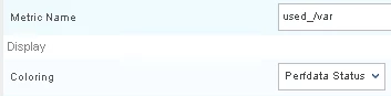
Also, the window size is just unbearable to see, this makes me sick
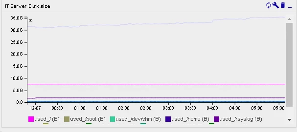
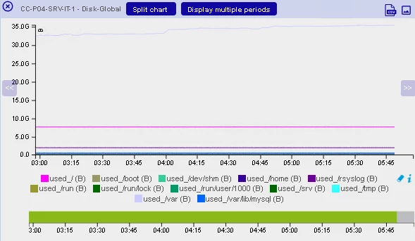
- You should add an option to get the same visual format of the graph widget than the one you can display in the performance graph menu, it works fine there, so why not in the widget?
- Moving widgets to columns is absolutely not friendly and does not work properly
- Centreon should REALLY take some inspiration from the competition before it’s too late