
Hi,
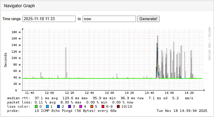
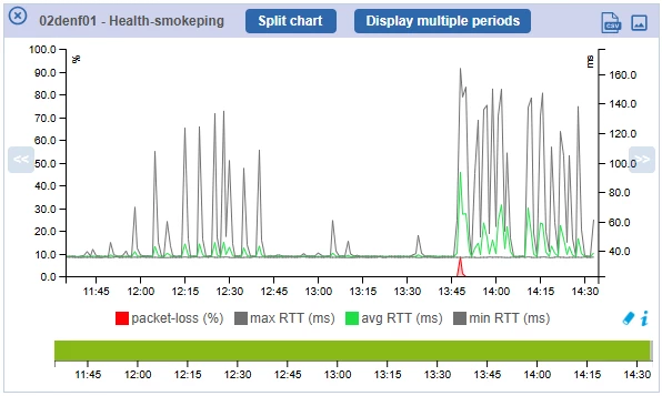
we are monitoring the reliability of WAN lines. We have a check, which measures the round-trip-time to a remote site and giving back the min, avg and max RTT.
I’d like to have a graph, which draws the avg as a solid line (that’s easy) and I want to have the area between the min and max filled with a colour. For those, who know smokeping, I like this kind of display a lot!
Maybe there are other use-cases, where a filled area between two metrics might be useful !?
Would it be possible to fill the max metric as usual and restore background colour (erase the filling of the max) with the min metric?