

Hi,
Since the new Centreon Plugins metrics system, information about “instances” (or one can call it dimensions) are splitted front-side to only show the metric name in the graph’s legend.
That is fine. But we loose key information.
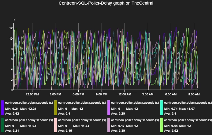
Here is a common example with a check on the Poller delays.
At first glance, we have the same metric eight times:
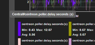
But if we put the mouse over one metric we’ll see a tooltip showing the exact metric name, with the “instance” part, here “Central”:
My proposition is to show that splitted-out part in the legend, for example as a label (i am no front dev!):
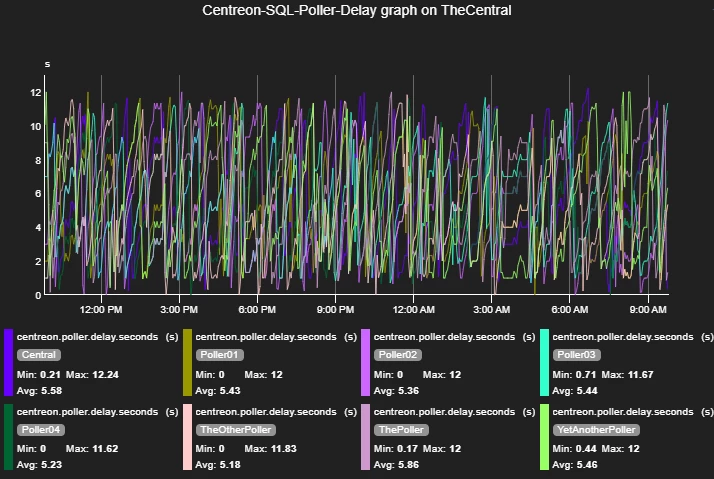
This will show the information without overing on the legend, but it is also “needed” to benefit from the data sources definitions (you know, the underused ‘Monitoring > Performances > Curves’ page).
Because as of know, the curves will not use the templates if doesn’t match exactly the data source (read metric) name, which is totally fine too.
Splitting the metric not only front-side but back-side can leverage the use of those templates, which can result to having both templates (legend, color, etc) and instances on graphs.
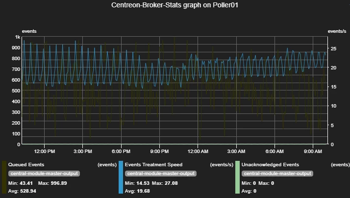
An example here on Broker statistics check, with 3 different metrics for 1 instance with curves templates for each metric:
Of course there are several scenarios.
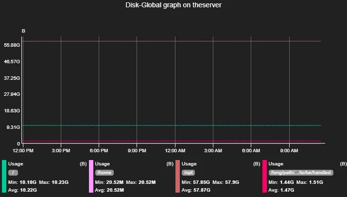
Here an example with the same metric on multiple instances :
This one is tricky as the curves should not have the same color.
There is also the “2 dimensions” metrics case with metrics built like “dimension1~dimension2#metric”.
Let the discussion begin!
