As the title says, I'd like to create a graphic for a service I've set up. I've created a service to find out the number of users connected to my RDS farm and I'd like to have a graph to see the evolution of connected users over time. A simple dot plot, say every 30 minutes.
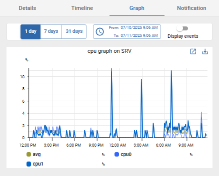
What I mean by a graph is like CPU, memory etc… :
Do you know if this is possible or not? Thanks by advance.
Best answer by Alexandre Belhomme
Hello, those are callled performance graphs, they are graphs generated from the RDD files saved at centreon.
They are generated based on the perfdata output of your command. You can follow the dev guidelines for plugins to add those performance data as your script output and it should generate data like in the screenshot
Hello, those are callled performance graphs, they are graphs generated from the RDD files saved at centreon.
They are generated based on the perfdata output of your command. You can follow the dev guidelines for plugins to add those performance data as your script output and it should generate data like in the screenshot
Hello, those are callled performance graphs, they are graphs generated from the RDD files saved at centreon.
They are generated based on the perfdata output of your command. You can follow the dev guidelines for plugins to add those performance data as your script output and it should generate data like in the screenshot