Monitoring graphs draw curves' peaks not with maximum Y-values

  • 20 December 2022
  • 2 replies
  • 96 views

Badge +1

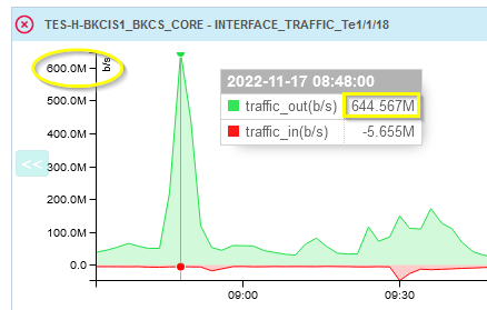
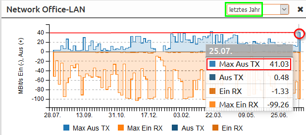
I have realized a strong effect on graph scales:
On the web interface periodically measured mean values (e.g. INTERFACE_TRAFFIC / CPU Load ) are displayed with correct peaks (Y-values) only when specifying an observation time period of less than 6 ¾ hours (3645 minutes).

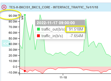
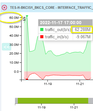
Displayed maximum peaks shrink seriously (due to coarsening) the more the observed time period grows:
1. 6 ½ hours:    668 mbit = 100 %
2. 6 ¾ h hours: 569 mbit =   85 %
3. 24 hours:      366 mbit =   56 %
3. 1 week:           92 mbit =   14 %
4. 1 month:         50 mbit =     7 %
5. 1 year:            36 mbit =     5 %

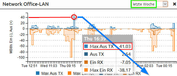
When checking for spare operating capacity, this can be quite deceptive.


2 replies

Badge +3

Hello,

Would it be possible to provide us a "How to test" or some screenshots so that we can reproduce the behavior that you describe to us internally? this would help us to understand this case clearly and find a possible solution


Thank you very much for your feedback and thank you in advance for your future response.


Best regards Baptiste

Badge +1

Sure. We use Centreon to visualize data transmission rate at the ports and work load of our Cisco network switches over time. Customizing is provided by a supplied service. Here are some graphs generated from the same collected data but with variant time frames. Sampling rate is 2 minutes. Complained effect can be seen on outliers: Peaks in number series shrink the more observed time intervall is enlarged. Measured maximum y-values are only visualized when displayed time slot smaller than 6 ½ hours. Have a special look at the vertical scale and value display (yellow marks):

  • Centreon observation intervall 1 day:


  • Centreon observation intervall 1 week:


  • Centreon observation intervall 1 month:


Here comes a counter visualization example (what I actually want to get) from another vendor, which does not shrink any peaks when extending observation time frame onto a whole year - a peak of 40 MBit/s stays always the same - a so called “max-based graph”:

  • Unify observation intervall 1 month:


  • Unify observation intervall 1 year:

Thank you very much for your interest - I’ve provided these screenshots for discussions already some time ago.

Reply