
Hello,
We would like a little adjustement to the default MAP view or options to let’s us costumize this part, at least.
Actually the MAP view design is very large and not compact, many people ask to review that problem, so we change some options directly to the code to have a better and usefull rendering.
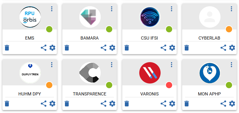
As you can see, the Titles are centered and the boxes are more compact. It’s clearly better.
Actually, each time we need to customize and edit the hardcoded values… it's not practical.
There is some customized references:
REMOVE the “to much” marked black rectangle
./lib/js-ng/main.js
=> 'stroke-width': 3 => 1
MAIN PAGE
To remove the scrollbar to have all maps displayed.
=> ./static/4116.a0260617.js => 4116.456a1713.js
mapsList:{
=> max-height:425px => 9999px (to remove the limit)
=> overflowY:"hidden" (to remove the scrollbar)
BOX COMPACT FORM:
return{wrapper:{backgroundColor
=> heigth:"auto" / minWidth:"175px"
wrapper:{cursor
=> 70px => auto
return{name:
=> return{name:{height:"auto"
=> textAlign:"center"
{title:{height:
=> marginTop:"40px"
wrapper:{left:0
=> position:"relative"
./static/2358.f78644ca.js => 9474.0bad2e00.js
last-child
=> padding-bottom 24 => 18
Best Regards,