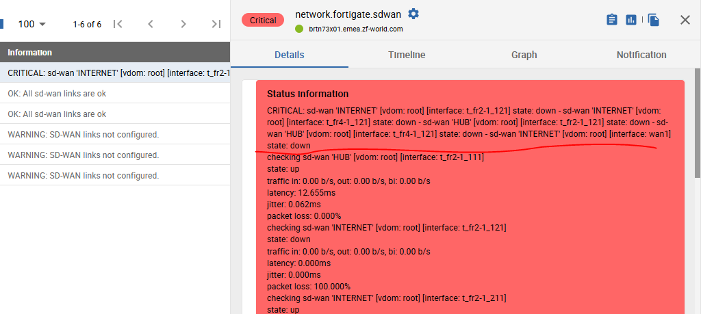
The old “Monitoring > Status Details > Services” nicely handles the short output (Status information column). In case output doesn’t fit the length of this column it wraps the content dynamically to show all of it.

The new “Monitoring > Resource Status” doesn’t handle this the same way. Which might be quite inconvenient. It just cut the content at some point. Even in case where there is still place to display it.

Would be nice to have it working as it is done in the old page.
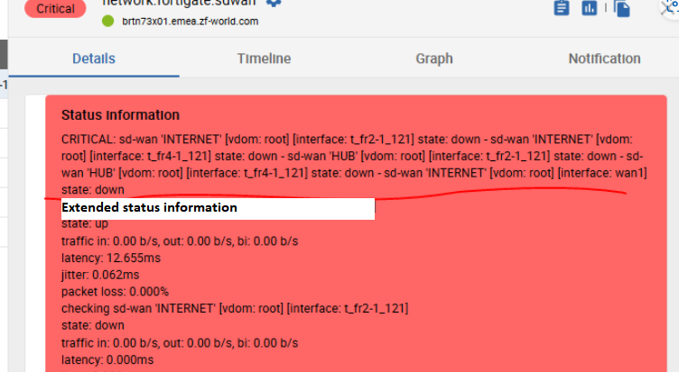
Moreover the service details pop-in for should indicate clearly where the extended info section (long_output) starts. Now this distinction is not visible - short_output and long_output are just displayed as one.

These are some small things which keep us still away from upgrading to 24.10 and later releases.


