Hi,
I started to use the new WebUI for the support : https://support.centreon.com/
It seems there is no way of formatting a message. No way of using italic, or fixed width. Am I missing something?
Also, I can join a file but can’t directly paste an image.
I opened a ticket (#58264) by sending a mail, the inserted image is there but all the formatting is lost.
Will it be improved? Currently it sucks. Sorry for the language but it really does :(
I feel I will like Zendesk a lot…
And what is the added value of https://premiumplus.app? There is a Zendesk official site/company: https://www.zendesk.fr
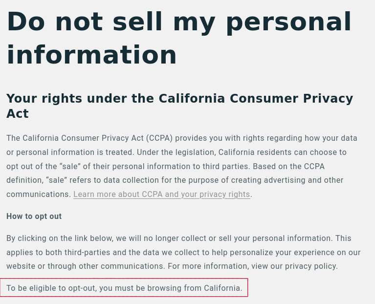
I must use a VPN to connect from California if I want to opt-out? WTF… I’m too tired to care about that anyway. But the UI without formatting and image pasting possibilities is a real problem for sure, I hope it wiil be improved soon. Luckily it seems this is still possible to use the good old email to communicate with the support.
Regards.
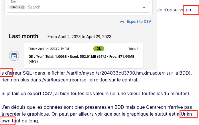
Let’s not even talk about the fucked up text justification:
OK, it’s enough fuckery for today, need my weekend…
Have a nice day though.
Hello
Thanks for your feedback.
We will check it and try to improve your user experience in the next weeks.
About the data privacy, it seems you saw the PremiumPlus policy:
https://premiumplus.app/pages/ccpa-opt-out
We just use their visual theme for the support portal.
About the Zendesk policy, you will find it here:
https://www.zendesk.com/company/agreements-and-terms/privacy-notice/
Regards
It’s been two months now. Can’t you at least manage to get the caesura issue fixed? I may be wrong but it seems it’s just a simple CSS parameter (word-break: break-word;)…
Currently, even a unformatted text is hardly readable because of that.
Can you tell us if you meet this issue only with the messages you sent by email?
I have this issue on all messages.
This is utterly annoying :
Hi,
I don’t understand why this issue is still present after so much time. Did you ever try to do something about it? How can you tolerate a so sever image deficit for your product/company? Centreon has too many customers?
When I read “We will check it and try to improve your user experience in the next weeks.”, three months ago, then silence and nothing has moved I feel mocked and it’s pissing me off.
(message written from the support’s UI : support.centreon.com)
You can use a tool that just works : Github’s issues, which is in no way relatable to this bullshit joke of Zendesk in terms of quality, ergonomy, usability, integration. In fact, in every aspects of helpdesk/software support.
What the point seriously?!
Reply
Login to the community
No account yet? Create an account
Enter your E-mail address. We'll send you an e-mail with instructions to reset your password.