
Hi,
This is from Centreon Web 23.10.18. Has it been fixed in 23.10.21 or in a more recent branch? I wouldn’t say it’s a bug, but a quite worrying design choice still imho.
Am I the only one for whom it matters quite a bit?

Hi,
This is from Centreon Web 23.10.18. Has it been fixed in 23.10.21 or in a more recent branch? I wouldn’t say it’s a bug, but a quite worrying design choice still imho.
Am I the only one for whom it matters quite a bit?
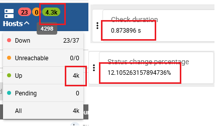
Hi
Indeed, there's too much rounding in the banner (for aesthetic reasons to give an idea of the magnitude) and, on the other hand, too little rounding in the details panel of the Resource Status menu.
I think this was fixed in version 24.x for the Status change percentage.
Regards
No account yet? Create an account
Enter your E-mail address. We'll send you an e-mail with instructions to reset your password.